Keyist: E-commerce Demo Website
Timeline
6 July 2019 - 10 February 2020Platform
WebsiteMy Role
Freelance UI/UX DesignerProject Overview
E-commerce demo website for Keyring Sales
This project is a part of my freelance UI/UX Designer experience, driven by my desire for gaining experience in the field and self-improvement. Keyist is an e-commerce platform specializing in selling keyrings, encompassing all essential pages expected of an e-commerce website. My primary goal was to design a seamless e-commerce flow while considering to fundamental principles of UI/UX design.
Problem
There are lots of things to concern to create flawless e-commerce flow
Designing a flawless e-commerce flow encompasses numerous considerations. E-commerce platforms comprise multiple crucial pages that collectively form a customer-centric system. One of the main challenges lies in striking a balance between user-friendly design principles and a structure that effectively motivates users to make purchases.
Goals
Create an e-commerce website that seamlessly caters to user needs, offers intuitive navigation, visually engages users, streamlines the checkout process
I considered the following objectives when designing my e-commerce flow:
-
User-Centric Design: The website should prioritize the needs and preferences of the users, providing an intuitive and enjoyable shopping experience.
-
Clear and Intuitive Navigation: The website should feature a well-organized and easily navigable structure, enabling users to find products, categories, and important information effortlessly.
-
Engaging Visual Design: The website should employ visually appealing and professional design elements, including high-quality product images, consistent branding, and attractive layouts.
-
Streamlined Checkout Process: The checkout process should be streamlined with minimal steps and clear instructions. It can offer convenient features like progress indicators to enhance the overall user experience.
-
Effective Product Presentation: The website should display products in a visually appealing and informative manner. It should include high-resolution images, comprehensive product descriptions, relevant details like pricing, availability, and variations.
-
Personalization and Recommendation: The website should display product suggestions based on user preferences, browsing history, and purchase patterns. This can enhance the user experience by offering relevant and targeted recommendations.
Research
Designing a User-Friendly and Seamless E-commerce Website
To create an e-commerce website that prioritizes user-friendliness and seamlessness, my research journey started with extensive competitive analysis, analyzing different e-commerce platforms to understand their approaches in presenting crucial information and facilitating user interactions.

Building upon this groundwork, I conducted user interviews with five regular e-commerce system users, seeking valuable insights through targeted questions about their experiences. I asked the following questions in the interviews:
-
When browsing for keyrings online, what specific features or information are most important to you in making a purchase decision?
-
How do you typically search for keyrings online? What search filters or sorting options do you find helpful?
-
How important is it for you to see detailed product descriptions, including material, dimensions, and additional product information?
-
Would you prefer personalized recommendations for keyrings based on your browsing history or previous purchases? How important is this feature to you?
-
Are there any specific features/views that you would like to see on the shopping cart pages?
Insights
Customers want to see user-friendly, easy-to-navigate, clear, and minimal e-commerce websites!
Based on the valuable data obtained from the interviews, I specified the following key points that users would like to see and have on the website:
-
A well-organized and easily navigable structure.
-
Finding products, categories, and important information easily.
-
High-quality product images, detailed product descriptions, customer reviews/ratings, and delivery&return information.
-
Search filters and sorting options for easy exploration and navigation.
-
Personalized recommendations based on browsing history and previous purchases.
-
Clear pricing, discounts, and promotions are displayed prominently.
-
A user-friendly shopping cart page with a concise summary of selected items and an easy checkout process.
Concept
Starting to write down my ideas
Based on the user interviews, I created a detailed persona profile to understand users’ needs, goals, and expectations.
Using this persona, I created a customer journey map that outlines users’ experience on the website.
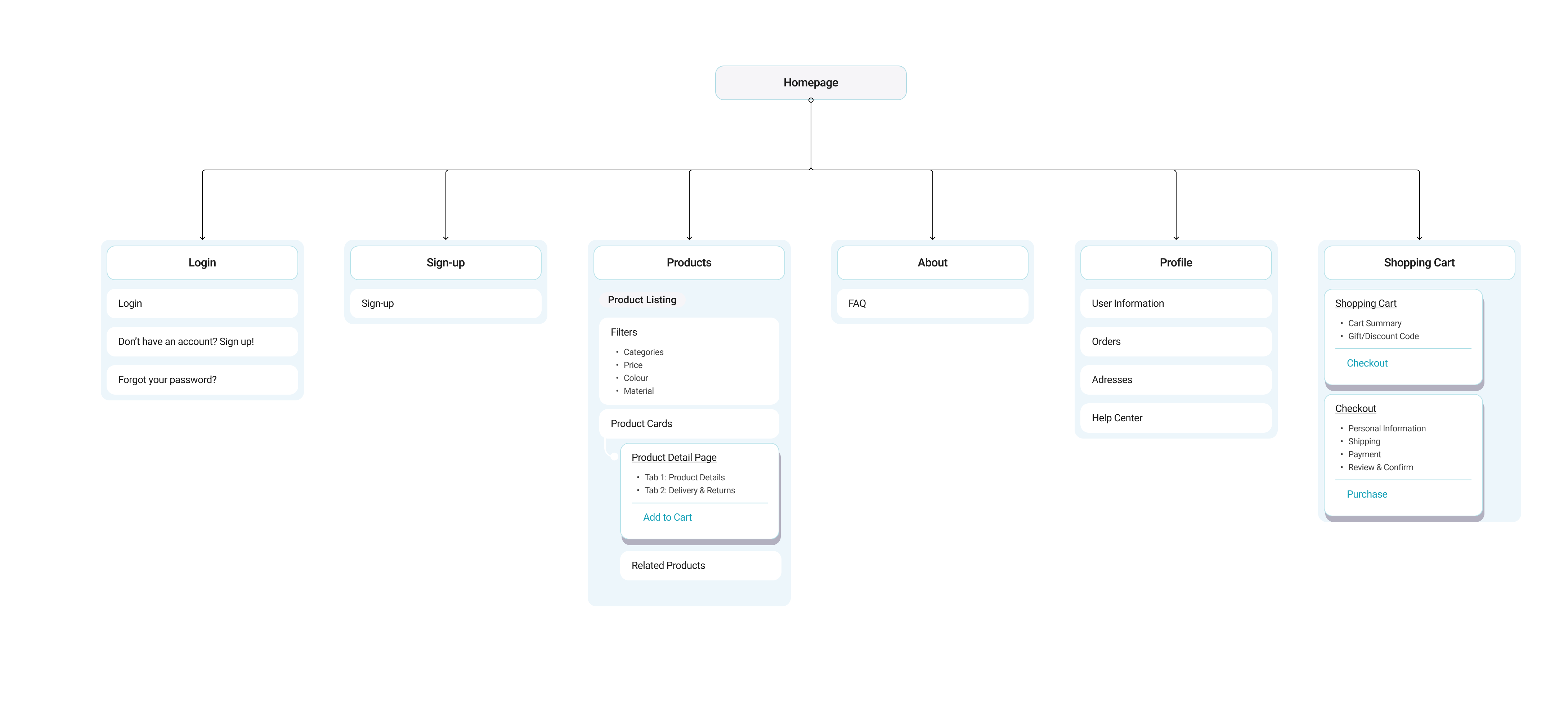
Additionally, I defined the information architecture to establish a clear and intuitive flow for the website.
Design
My solutions to the users' needs and expectations
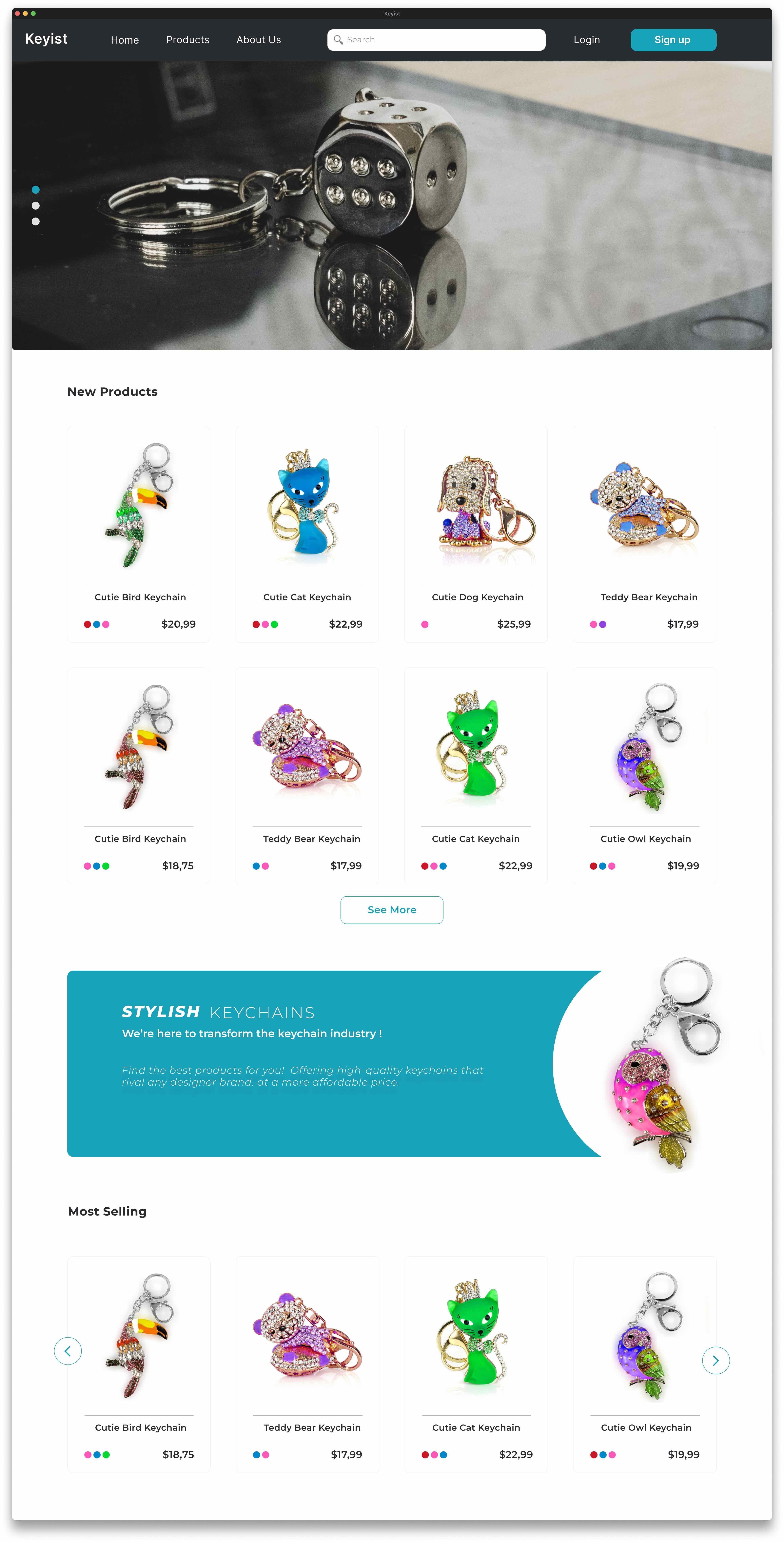
The homepage prominently showcases new products, best-selling items, and engaging advertising banners to capture the users' attention.
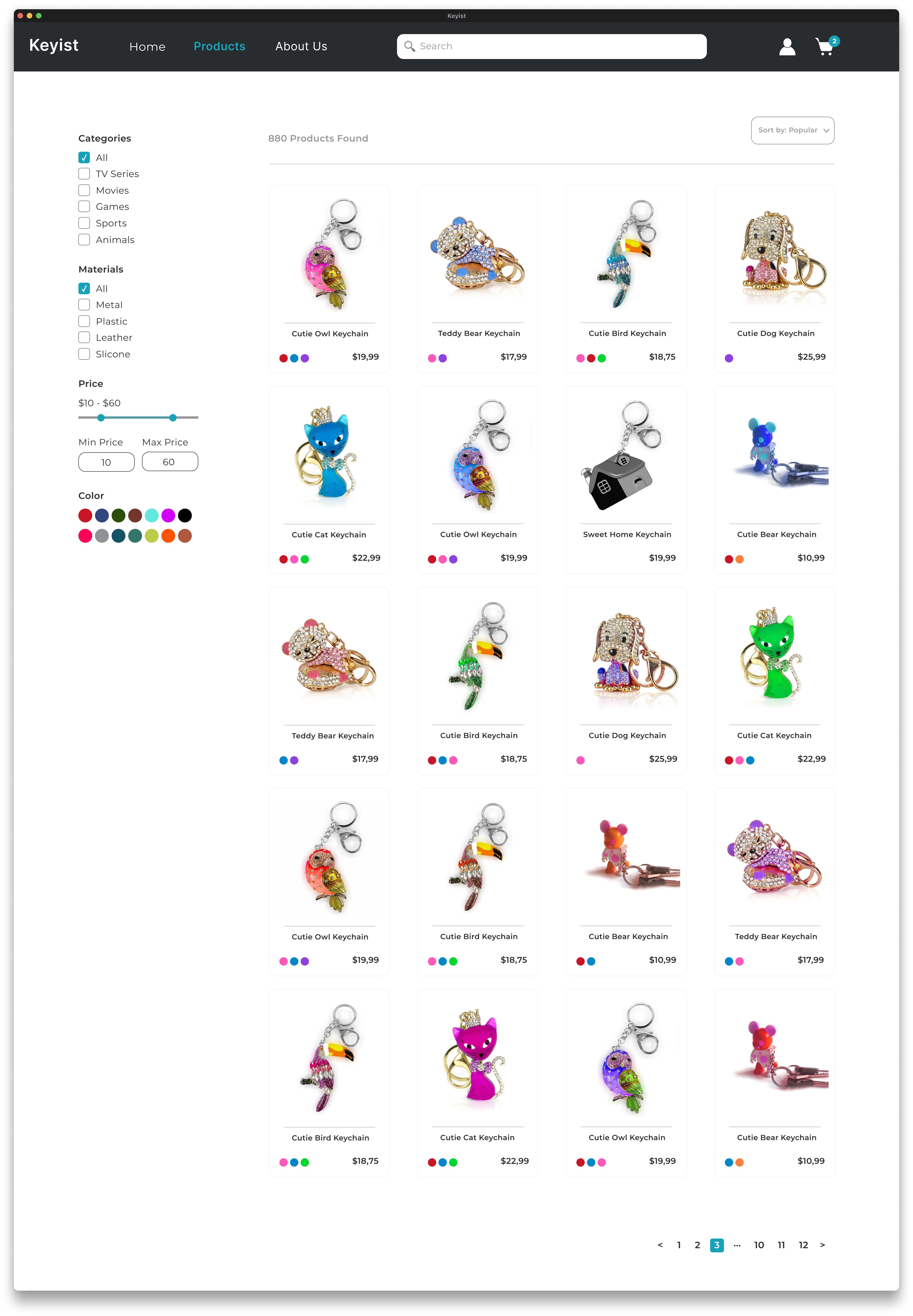
On the product listing page, I implemented various filter options allowing users to refine their search based on product features and prices. Additionally, users have the flexibility to sort the products according to their preferences.
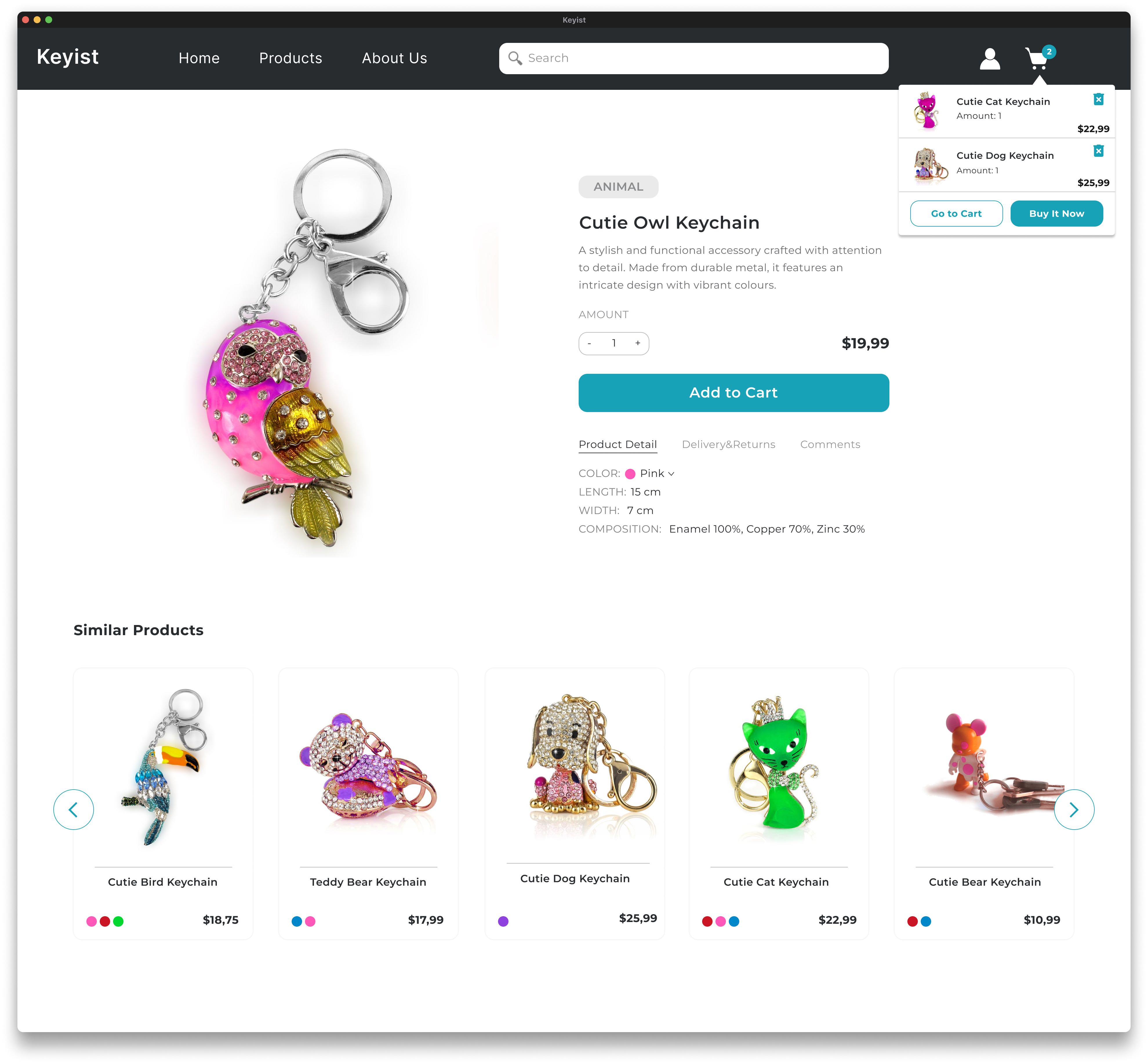
The product detail page features a high-quality and prominent product photo. The price is displayed prominently using bold and larger text. The "Add to Cart" button is prioritized, being the largest element on the page and utilizing a primary color to attract attention. Relevant recommendations for similar products are also presented.
The shopping cart provides a clear and concise summary of the added items, enabling users to easily proceed through the checkout process.
The checkout process includes a progress bar that visually guides users, indicating the necessary steps and tracking their progress.
Final Product
Overview of the Final Screens
Reflections
What I'd do differently next time
User testing restrictions: I couldn't perform a user test to discover potential mistakes, flaws, and improvements in the final user interface. Consequently, I transferred the design screens directly to the development and conducted the final checks during User Acceptance Testing (UAT).
If you would like to view the live website, please check the following link: 👉 Keyist