Flower Garden: Flower Delivery Service
Timeline
14 January 2021 - 21 January 2021Platform
Responsive WebsiteMy Role
Solo UI/UX DesignerProject Overview
Case Study for an E-commerce Brand Specializing in Flower Delivery
During my job application process with an E-commerce brand specializing in flower delivery, I undertook this project as a case study. For company privacy, I will use a dummy brand name instead of the actual name of the company while presenting the case. The primary objective was to redesign the product detail page of the brand, focusing on creating a seamless, intuitive, and user-centered experience.
Problem
So many things to present to the customers on the product detail page
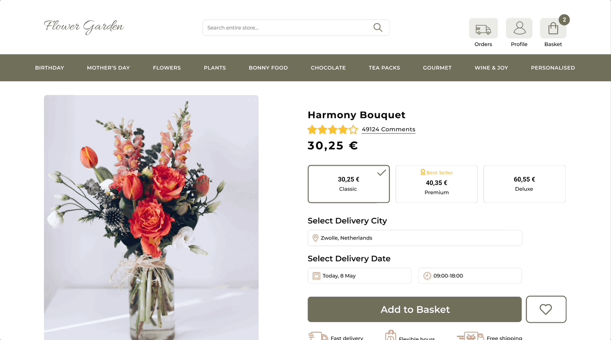
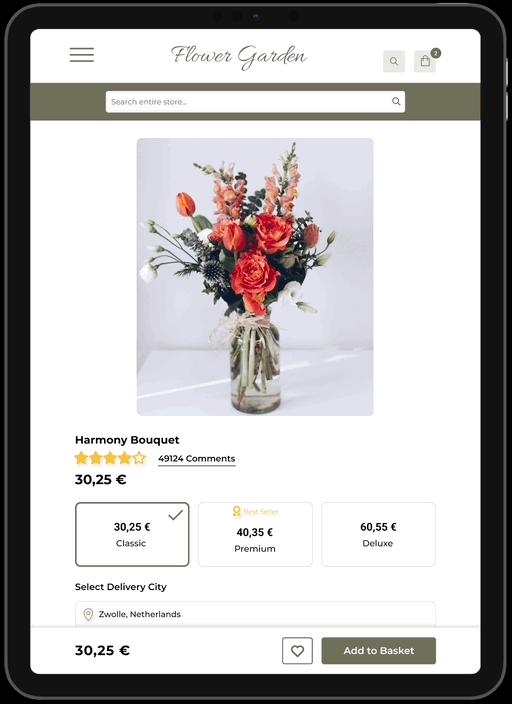
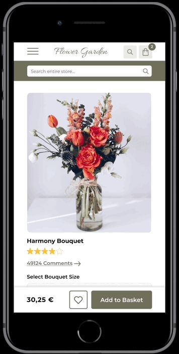
The brand's product detail page encompasses various actions and information:
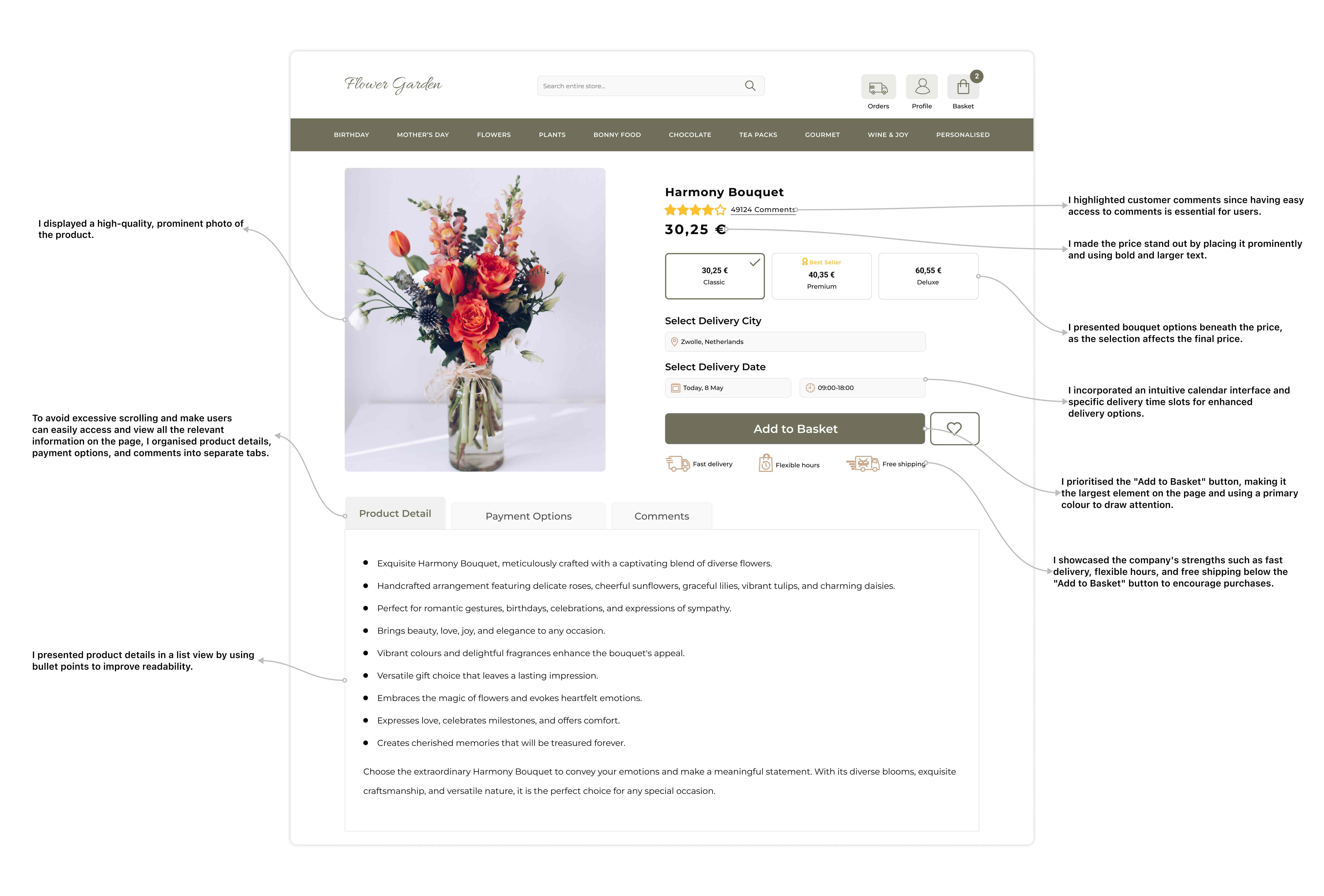
Bouquet selection: Customers have the option to choose from classic, premium, or deluxe bouquets.
Delivery options: Customers have the ability to select the delivery city and desired delivery date.
Highlighting brand strengths: The brand showcases its strengths, including fast delivery, flexible delivery hours, and free shipping.
Providing necessary information: The page displays product details, payment options, and customer comments.
Similar product recommendations: The brand shows similar products that customers might find appealing.
Category Navigation: Customers have the option to explore related product categories.
The challenge at hand is to present a multitude of actions and information in a cohesive, seamless, and intuitive hierarchy.
Goals
Organize various actions and information in a coherent, seamless, and intuitive hierarchy
-
Ensuring a cohesive, smooth, and intuitive hierarchy, users should be able to effortlessly review all elements on the page.
-
The navigation experience should be seamless, allowing users to proceed to the payment process without encountering obstacles. Emphasizing the "Add to Basket" option is crucial in alignment with the company's objectives.
-
To avoid user confusion, UI elements with similar purposes should be grouped and presented in a clear manner. It is essential to eliminate any potential ambiguity and provide a straightforward user experience.
-
To enhance usability, the product detail page should be designed to avoid excessive scrolling. By condensing the content and minimizing the need for long scrolls, users can easily access and view all the relevant information on the page.
Research
A journey to make product detail page super clear and user-friendly
I started my research by conducting a comprehensive competitive analysis. I examined various flower delivery services, carefully observing how they present essential information and facilitate user actions.

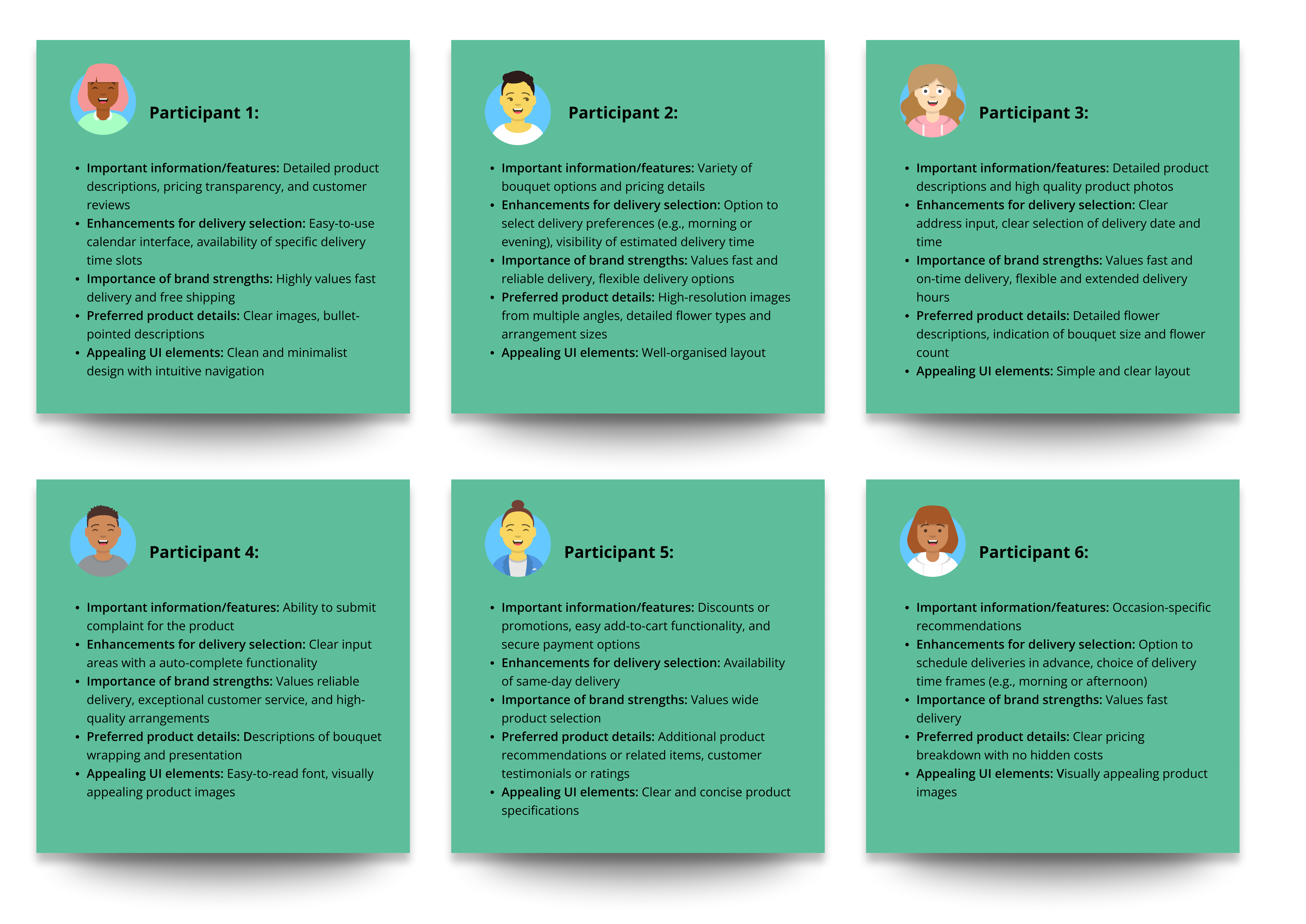
Building upon this, I proceeded to conduct user interviews with six participants who are regular users of flower delivery systems in their daily lives. I formulated the following questions to gain valuable insights from their experiences:
-
When visiting a product detail page on a flower delivery website, what specific information or features are most important to you in making a purchasing decision?
-
When choosing a delivery city and date, what functionalities or user-friendly aspects would enhance your experience?
-
How important is it for you to see the brand's strengths and unique selling points, such as fast delivery, flexible hours, or free shipping, prominently displayed on the product detail page?
-
When reviewing the product details, what specific information would you like to see included, and how would you prefer it to be presented (e.g., bullet points, descriptions, images)?
-
Regarding the user interface, are there any particular design elements, layouts, or visual cues that you find helpful or appealing on a product detail page?
Insights
Users want to see a product-based page with a clear layout!
Based on the valuable insights obtained from user interviews, I revealed the following key findings:
-
Users prioritize high-quality product photos, detailed descriptions, and customer reviews for informed decision-making.
-
Clear pricing, a diverse range of flower options, and attractive discounts/offers are important factors for users.
-
Users prefer a minimalistic design approach with a transparent pricing breakdown.
-
Easy-to-use calendar interfaces and the availability of specific delivery time slots can enhance the delivery options experience.
-
Users prefer product detail information presented with high readability for effortless comprehension.
Concept
Beginning to organize my thoughts on paper
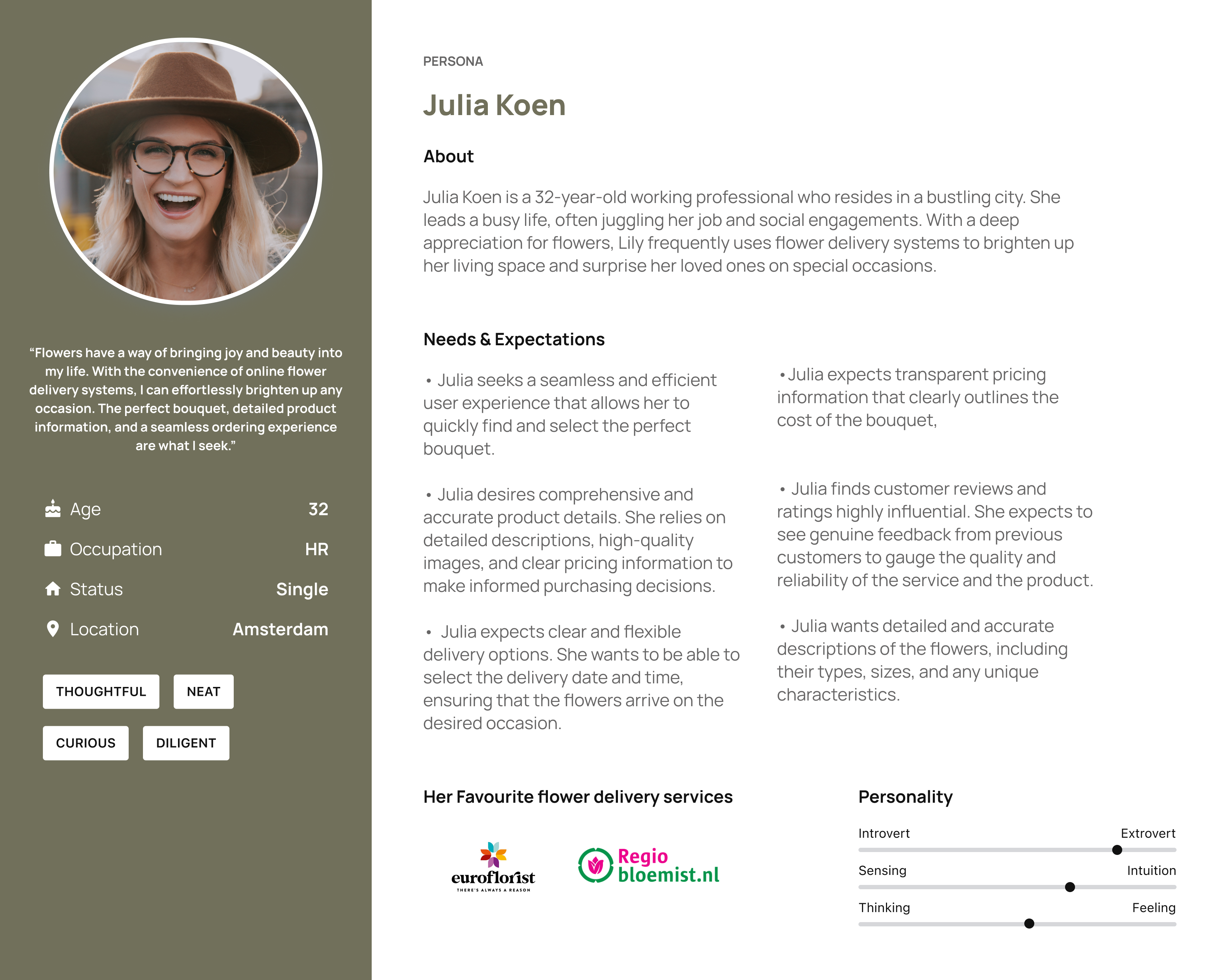
I developed a persona profile and defined her needs, goals, and expectations based on the user interviews.
After that, I made some sketches to demonstrate my initial ideas and strategy using low-fidelity mock-ups.
Design
My solutions to the users' needs and expectations considering a user-friendly hierarchy
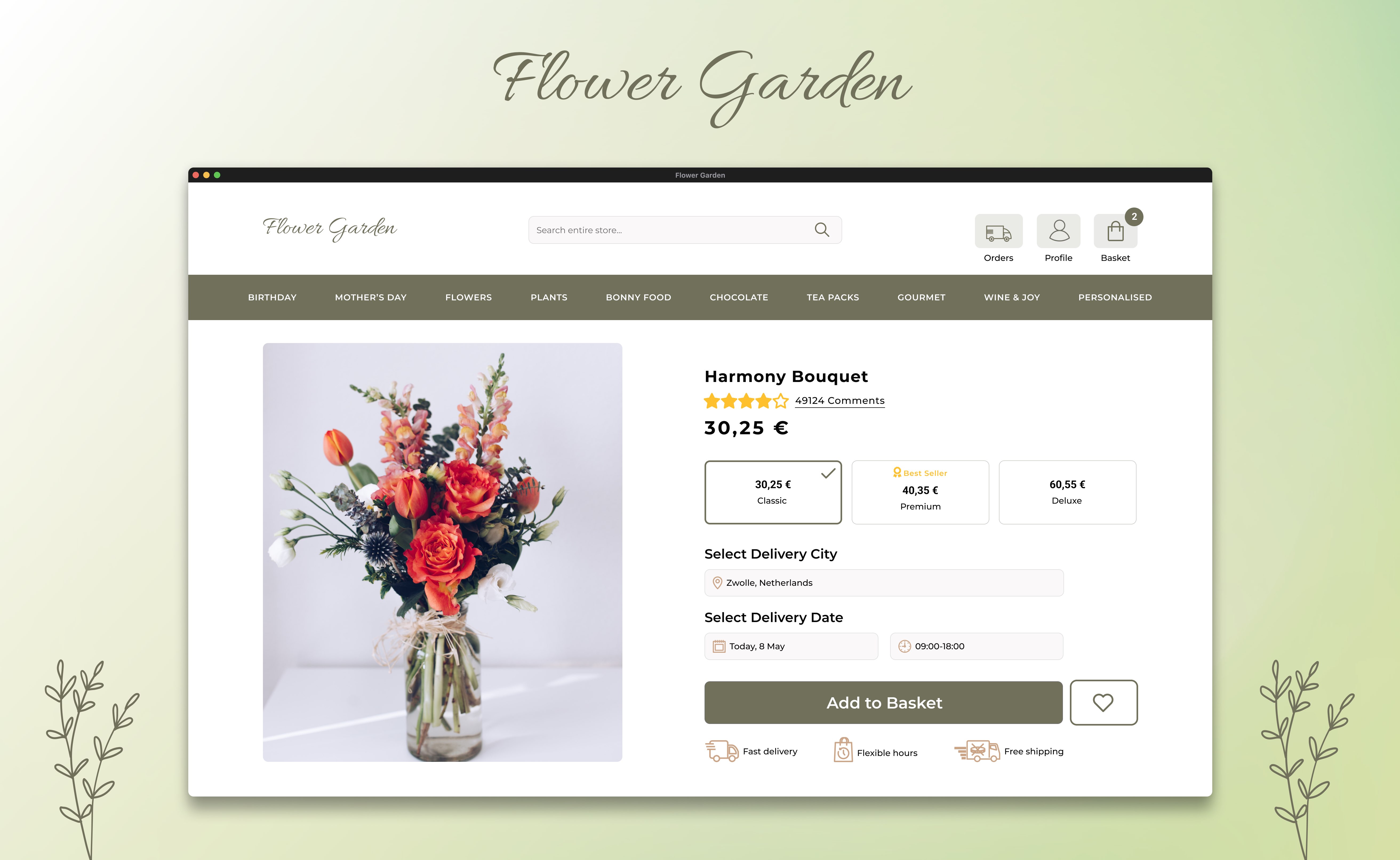
Final Product
Overview of the Final Screens
Website
Tablet
Mobile
Reflections
What I'd do differently next time
Time constraints, limited iteration: Due to the tight one-week timeframe for this case study, I faced limitations in exploring multiple iterations and variations of my solutions.
User testing constraints: Unfortunately, the time constraints also prevented me from conducting a comprehensive user test to uncover any potential mistakes or errors in the final user interface design.